Long-Term Care Financial Benchmarking

Financial benchmarking in long-term care means taking a facility's numbers, margins, cost per patient day, staffing ratios, and lining them up against what peer facilities are actually posting. The point isn't a grade. It's diagnostic: when occupancy sits above the regional average but margin still lags, benchmarking tells you where to look next, and that's the whole value of the exercise in one sentence.
Skilled nursing operators need this more than most sectors need any single management tool. You're running two service lines under one roof, post-acute rehab and long-term custodial care, billing payer types that pay wildly different rates, under a regulatory regime that can change mid-year without warning. Gut instinct doesn't hold up against that kind of complexity. Plante Moran's 2025 SNF Benchmarking Report pulls from data on more than 12,000 nursing facilities, and that scale matters: CFOs need this to defend budget assumptions to a board, lenders need it to underwrite, auditors need it to sanity-check the general ledger.
The financial environment benchmarking has to account for in 2025
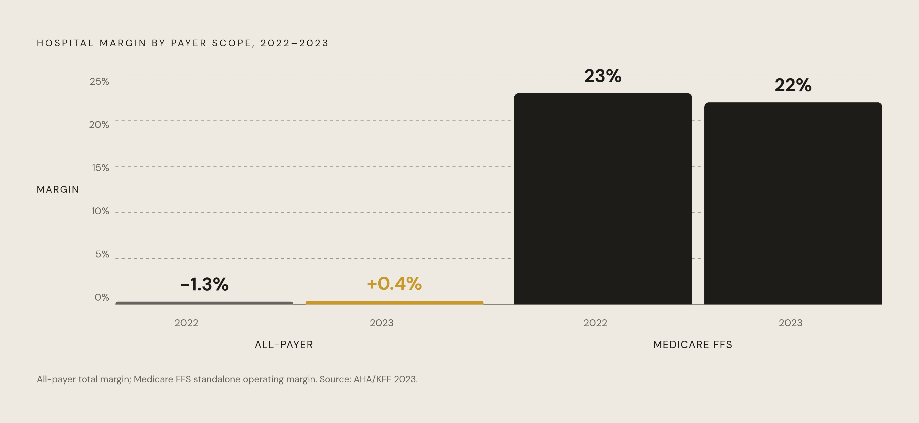
Start with the headline number. MedPAC's March 2025 report shows the sector's all-payer total margin moved from -1.3% in 2022 to 0.4% in 2023. That's real recovery. It's also razor thin, the kind of margin that evaporates if one payer category shifts or one wage line spikes without warning.
Medicare fee-for-service still does most of the heavy lifting. SNF margins on Medicare FFS patients ran 22% in 2023, down slightly from 23% the year before. So the volume and mix of Medicare FFS residents a facility carries explains more of its bottom line than almost anything else on the P&L. But Medicare Advantage now covers over half of all Medicare beneficiaries, and MA plans routinely pay below what FFS pays for comparable care. A benchmark built on a facility's old FFS-heavy mix will overstate what's achievable today if MA has quietly eaten into that mix and nobody adjusted for it. Worth sitting with that for a second: the same facility, same beds, same staff, can look like it's falling behind purely because its payer contracts shifted underneath it.
CMS tried to soften the blow. The FY 2025 payment update raised Medicare Part A payments by a net 4.2%, around $1.4 billion industry-wide: a 3.0% market basket increase plus a 1.7 percentage point forecast error correction, minus a 0.5 percentage point productivity cut. That helps against cost inflation. It doesn't close the structural gap between MA and FFS rates, and it was never built to.
There's a more encouraging backdrop too. Senior living has posted twelve straight quarters of occupancy growth, and every major market now sits above 80% occupancy. A rising tide like that makes benchmarking numbers look better across the board, so separating real operational gains from the tide itself matters more than people give it credit for. The ownership map underneath is also moving fast: 144 publicly announced SNF transactions closed in just the first half of 2024. A peer group built on last year's roster of owners might already be stale by the time anyone runs the report. Meanwhile home- and community-based care keeps pulling long-term care census away, and Medicaid rates in a lot of states still don't cover the cost of care. The recovery in post-acute margins is masking a real fault line on the custodial side, and any payer-mix benchmark that doesn't separate the two dynamics is only telling half the story.
The metrics that carry the most diagnostic weight
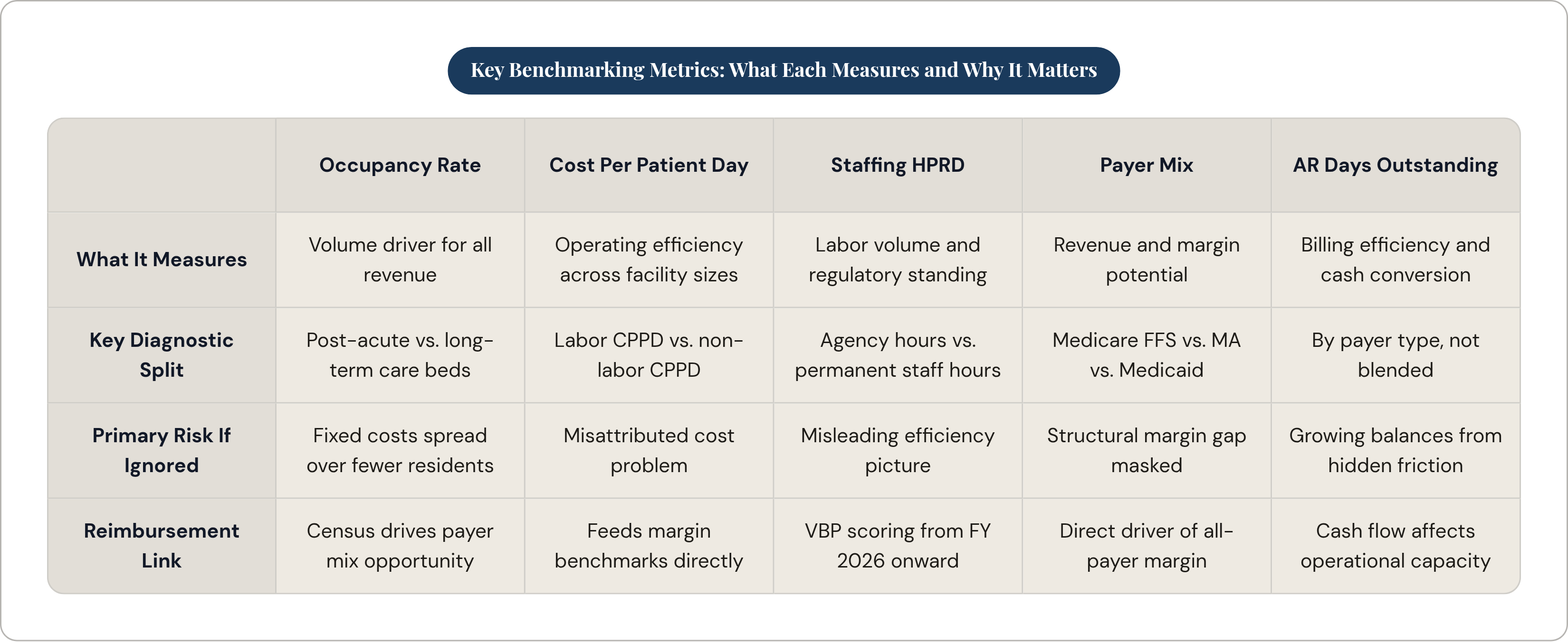
Occupancy comes first because it's the volume driver everything else depends on. The industry backdrop above 80% is the reference point, but a facility's mix of post-acute versus long-term care beds changes how you read its own number. Two facilities at similar high occupancy can carry very different revenue and cost profiles depending on which beds are actually filling. When occupancy falls short, fixed costs spread across fewer residents, and cost per patient day widens against peers faster than most people expect.
Cost per patient day, CPPD, is the workhorse efficiency metric. It normalizes total operating cost against actual patient days, so a 60-bed facility and a 180-bed facility land on equal footing. The aggregate number alone doesn't say much, though. Break it into labor CPPD and non-labor CPPD, because those two lines point at different problems entirely. High labor CPPD with normal non-labor CPPD usually means a staffing or wage issue. Flip that pattern and you're looking at supply costs or contract pricing instead.
Staffing hours per resident day, HPRD, deserves attention because the ground just shifted under it. The federal minimum staffing rule got repealed under Public Law 119-21, signed July 4, 2025. That doesn't make HPRD irrelevant, not even close. New York and California still hold facilities to standards at or above 3.56 HPRD, and the repealed federal benchmark, 3.48 total HPRD, 0.55 RN HPRD, 2.45 nurse aide HPRD, still anchors how CMS scores quality and Value-Based Purchasing performance. Facilities still tracking against that old federal number are, in practice, in better shape than those that dropped it the day the rule died. Watch for one distortion here: agency staffing rates have run well above employed-staff rates since the pandemic, and if agency spend isn't separated from permanent-staff spend in the HPRD cost data, the benchmark will mislead you about where the money's actually going.
Payer mix, the split between Medicare FFS, Medicare Advantage, Medicaid, and private pay, probably explains margin variance between facilities better than any other single number here. A facility with occupancy identical to its peer group but a heavier MA share will benchmark below on margin. That's a structural reality needing its own explanation, not a panic response. Revenue per patient day by payer helps too, since averaging across the whole census can hide a Medicaid shortfall behind healthy Medicare FFS revenue. MedPAC reports both an all-payer margin and a Medicare FFS-only margin for exactly this reason, and operators should run the same play: track both figures separately, so a gap traces back to payer mix or to how the facility actually runs, not lumped together and guessed at.
A few more numbers round out the set. Staff turnover feeds directly into CMS VBP scoring starting FY 2026 under the Nursing Staff Turnover measure, so it's a cost problem and a reimbursement risk at once. The 30-day readmission rate is scored in VBP today but gets replaced in FY 2028 by the Within-Stay Potentially Preventable Readmissions measure, so tracking both now beats scrambling later. And accounts receivable days outstanding, broken out by payer, shows where billing timelines, prior authorization headaches, or post-payment reviews are dragging cash conversion below what peers manage.
How staffing costs deform the benchmarks and what operators do about it
Labor is usually the largest cost line in a skilled nursing operation. When labor moves, every margin benchmark tied to it moves too. Everyone nods along to that in a budget meeting and then quietly underweights it when the actual numbers get built. It happens more than anyone likes to admit.
The repealed federal minimum staffing rule was projected to cost the industry $43 billion over ten years. Repeal removes the compliance floor, but it doesn't fix workforce scarcity or wage inflation, because those don't disappear just because the mandate did. Fewer than a quarter of facilities were expected to meet the full 3.48 HPRD standard even at enactment, which means most operators were already spending heavily just to get close. Their current HPRD benchmarks carry that spending whether the rule still exists or not.
The agency labor distortion is specific and it's real. Contract labor rates have stayed elevated since the pandemic, well above what employed staff cost, and a raw HPRD benchmark that doesn't separate the two makes a facility's staffing look better or worse than it actually is. The fix isn't complicated in concept, even if it's tedious to run day to day: benchmark HPRD as a volume measure and labor cost per HPRD as a price measure, independently. A facility can hit its target hours and still blow its labor budget if too many of those hours are agency hours billed at a premium.
CMS is about to make this worse for operators who don't get ahead of it. Starting FY 2026, VBP scores both Nursing Staff Turnover and Total Nurse Staffing, so a facility leaning on agency labor because of high turnover takes a double hit: higher cost now, lower VBP score showing up in reimbursement later. Staffing minimums also vary by state even after the federal repeal, so peer group construction has to account for regulatory floor differences between, say, a facility in California and one in a state with no minimum at all. Facilities that made real headway on their permanent-to-agency ratio, and built retention programs with actual internal float pools, tend to show up with lower labor CPPD and lower turnover scores. That's the gap benchmarking should point operators toward closing.
Reimbursement mix and quality performance as interlinked financial drivers
Quality scores aren't a reputation exercise anymore. They're a reimbursement mechanism, full stop. CMS raised the VBP payment adjustment range from 2% to 3% starting FY 2025, raising the direct financial stakes tied to quality performance. QRP reporting failures carry their own separate penalty too: a 2% cut to the annual payment update for non-compliance, which CMS estimated at $187.69 million in aggregate reductions across the industry under the FY 2025 final rule.
The Five-Star Quality Rating matters in a way that's easy to underrate on a spreadsheet. It drives referral volume, and it drives which Medicare Advantage plans want a facility in network. A facility's star rating, benchmarked against its regional peer set, predicts near-term census about as well as any financial ratio here does.
There's a feedback loop worth sitting with. Better quality scores build a stronger star rating, which builds better referral relationships with MA plans and ACOs, which improves payer mix, which strengthens margin, which frees up capital to reinvest in quality. It runs as a virtuous cycle right up until it doesn't. Benchmarking is how you catch the moment it starts running backward, a star rating quietly sliding relative to peers before the census numbers even catch up to it.
States are also increasingly adopting PDPM-style case-mix models for Medicaid reimbursement, which changes how resident acuity translates into payment. Facilities that benchmark their case-mix index against peers can catch it if they're being paid below what their actual resident acuity should command. That's money sitting on the table for a lot of operators who haven't gone looking for it yet. On readmissions, the FY 2028 shift to Within-Stay Potentially Preventable Readmissions gives operators roughly a two-year runway to benchmark against the new standard now instead of scrambling once the old measure disappears.
Building a valid peer group and interpreting gaps honestly
Most benchmarking exercises go wrong at the peer group stage. Comparing a facility against the wrong set, then reading a structural difference as an operational failure, sends management attention chasing a problem that doesn't actually exist in the form they think it does.
Peer group construction has to account for facility size, since fixed-cost leverage plays out differently in a 60-bed facility than a 250-bed one. Geography matters too. Labor costs, Medicaid rates, and typical occupancy all shift by state and metro area, so comparing a rural Midwest facility to an urban Northeast one on cost per patient day without adjusting for that is close to meaningless. Ownership structure, for-profit versus nonprofit versus government-run, changes the cost structure and financing picture enough that it belongs in the peer group definition as well. And service line mix, how post-acute-heavy versus long-term care-heavy a facility runs, shifts the expected numbers on margin, HPRD, and AR days in ways that have nothing to do with how well the place is actually managed.
MedPAC's own methodology offers a useful lesson here. Its 2025 report explicitly revised how it calculates SNF margins to account for facility-level and payer-mix differences in the cost of treating Medicare patients, which is why prior Medicare FFS margin figures got revised upward. If the body that sets the national reference point had to correct for composition effects, operators comparing their own facility against a crude national average are probably missing something too.
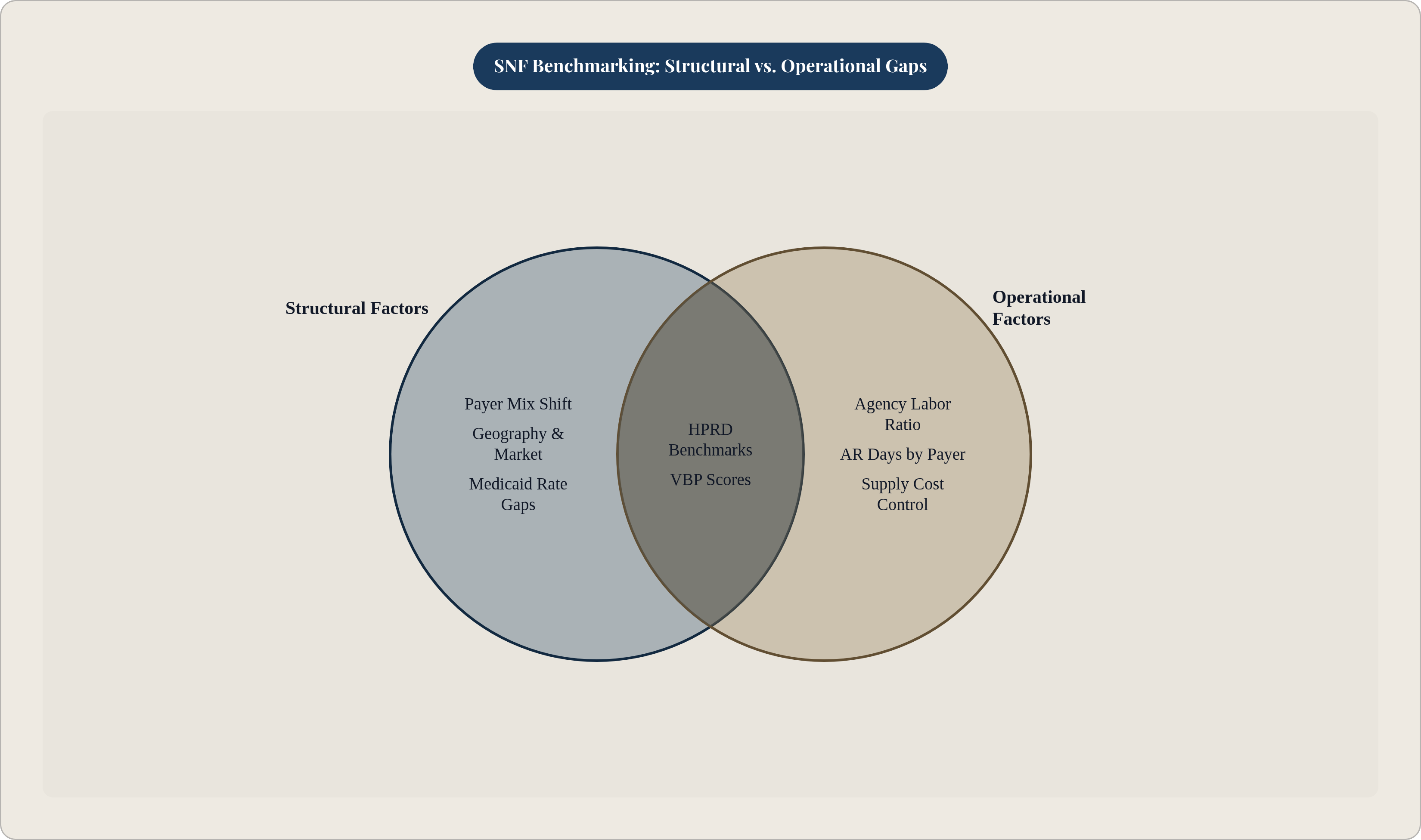
Once the peer group is right, gap interpretation still needs sorting. Structural gaps, driven by payer mix, geography, or resident acuity, are ones benchmarking can explain but operations alone can't fix. Operational gaps, tied to labor efficiency, AR management, or supply costs, are the ones management decisions actually move. Compliance gaps, QRP reporting failures or VBP shortfalls, carry direct payment consequences and need triage before anything else gets attention. National reports from Plante Moran, CLA, BerryDunn, and MedPAC set the industry floor for this kind of comparison, but they work best layered with state-level data and, where an operator can get it, market-specific numbers from lenders or state associations. Frequency matters more than people give it credit for, too: an annual benchmarking cycle misses a payer-mix shift that happens in March and doesn't show up until next year's report. Quarterly tracking against a fixed peer group catches that shift while there's still time to act on it.
Turning benchmark gaps into specific operational actions
A labor cost gap needs splitting at the root before anyone can act on it. Is HPRD itself too high, meaning overstaffing or a census problem? Or is the rate per HPRD too high, meaning agency dependency or overtime creep? Different diagnoses call for different fixes. The agency-to-permanent staffing ratio is the lever that actually moves the number: cutting reliance on contract labor compresses cost per HPRD toward the peer median directly, and it chips away at the turnover risk about to show up in VBP scores in FY 2026.
A payer mix gap points toward the negotiating table. Walking into an MA contract renewal with benchmarked per-diem data, showing what peers have secured relative to FFS rates, gives an administrator real leverage instead of a guess. On the Medicaid side, tracking case-mix index against peers can reveal whether a facility is undercoding acuity and leaving money on the table it's entitled to.
An occupancy gap usually traces back to referral relationship quality and star rating, both benchmarkable and both movable on a defined timeline, even one that runs longer than a fiscal quarter. An AR days gap needs a payer-by-payer breakdown to figure out whether the holdup is billing timeliness, prior authorization friction, or disputed post-payment reviews. Understaffed revenue cycle teams tend to let AR balances grow disproportionately. That's a resourcing problem more than a policy one, and it's one of the easier gaps to close once someone actually names it.
A QRP compliance gap needs the fastest response, because the penalty is automatic: 2% off the annual payment update, no negotiation. The first move there is a compliance audit of the reporting process itself, not a financial deep dive. CMS is set to start randomly selecting a large sample of SNFs beginning FY 2027 for MDS and claims data validation, and facilities with shaky documentation will get caught flat-footed if they haven't cleaned this up ahead of time.
None of it works without someone owning it. A benchmark sitting in a report that nobody's accountable for is wallpaper, plain and simple. Every metric needs a named owner and a quarterly review that actually reaches the board or governance level, or the same gaps show up again next year, dressed up in a new spreadsheet.
What the financial statements underlying benchmarking must accurately reflect
All of this, every ratio and every peer comparison, only works if the financial data feeding it is accurate. A facility can build the most carefully constructed peer group in the industry, and none of it will matter if its own books aren't complete and prepared the same way period over period. Benchmarking assumes comparable inputs. Sloppy or inconsistent statements break that assumption before the analysis even starts.
SNF financial statement audits need to hold up under generally accepted auditing standards, and where federal funding is involved, HUD Section 232 financing being common enough in this sector that most operators run into it eventually, the reporting has to satisfy an added layer of federal scrutiny on top of GAAS. That's not a bureaucratic afterthought. It's the foundation the entire benchmarking exercise sits on, and every metric discussed here, from CPPD to payer mix to AR days, is only as trustworthy as the ledger it came from.